반응형
import matplotlib.pyplot as plt
import numpy as np
import pandas as pd
In [5]:
# plot 시각화
plt.plot([1,5,7,3,7])
plt.rc("font", family = "Malgun Gothic")
plt.title("호호")
plt.show()
In [4]:
# plot 시각화 컬러변경
sales = [1, 5, 7, 3, 7]
month = ["mar", "apr", "may", "jun", "jul"]
plt.title("월별 판매 실적")
plt.plot(month, sales, color = "y")
plt.show()
In [6]:
# plot 해상도 변경
plt.figure(dpi=150)
plt.title("월별 판매 실적")
plt.plot(month, sales, color = "y")
plt.show()
In [17]:
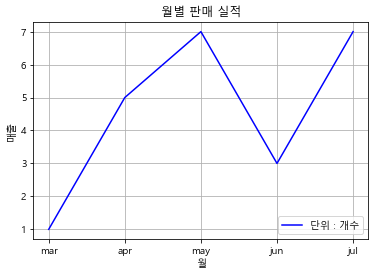
# plot 레이블 추가
plt.title("월별 판매 실적")
plt.plot(month, sales, color = "b", label = "단위 : 개수")
plt.legend(loc = "lower right")
plt.show()
In [19]:
# plot 시각화 grid 추가
# plot x,y레이블 추가
plt.title("월별 판매 실적")
plt.plot(month, sales, color = "b", label = "단위 : 개수")
plt.legend(loc = "lower right")
plt.xlabel("월")
plt.ylabel("매출")
plt.grid()
plt.show()
In [20]:
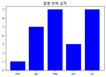
# bar 차트
plt.title("월별 판매 실적")
plt.bar(month, sales, color = "b")
plt.show()
In [ ]:
In [24]:
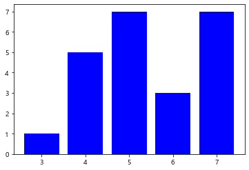
# bar range로 데이터 사용
plt.bar(range(3,8), sales, color ="b")
plt.show()
In [25]:
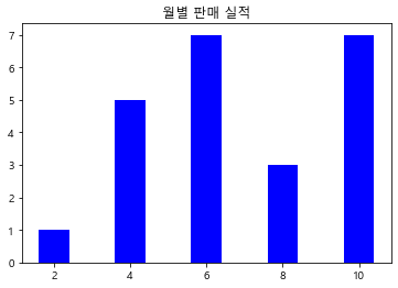
# range(간격 주기)
sales = [1,5, 7, 3, 7]
plt.title("월별 판매 실적")
plt.bar(range(2, 11, 2), sales, color = "b")
plt.show()
In [27]:
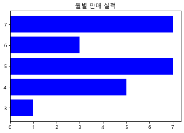
# 가로막대 차트
sales = [1,5, 7, 3, 7]
plt.title("월별 판매 실적")
plt.barh(range(3, 8), sales, color = "b")
plt.show()
In [36]:
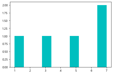
# 히스토그램 그리기
sales = [1,5,7,3,7]

plt.hist(sales, color="c")
plt.show()
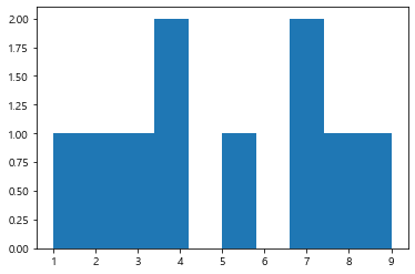
In [63]:
# 랜덤을 이용한 데이터 생성 후 히스토그램 생성
import random

a = []
for i in range(10):
    a.append(random.randint(1, 10))
print(a)

plt.hist(a)
plt.show()
[7, 8, 9, 5, 2, 1, 4, 4, 3, 7]
In [70]:
# bins를 통해 그래프의 간격 조정
a = [7, 5, 3, 3, 1, 3, 2, 10, 7, 8]
plt.hist(a, bins=20)
Out[70]:
(array([1., 0., 1., 0., 3., 0., 0., 0., 1., 0., 0., 0., 0., 2., 0., 1., 0.,
        0., 0., 1.]),
 array([ 1.  ,  1.45,  1.9 ,  2.35,  2.8 ,  3.25,  3.7 ,  4.15,  4.6 ,
         5.05,  5.5 ,  5.95,  6.4 ,  6.85,  7.3 ,  7.75,  8.2 ,  8.65,
         9.1 ,  9.55, 10.  ]),
 <BarContainer object of 20 artists>)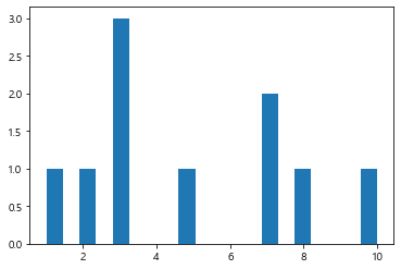
In [76]:
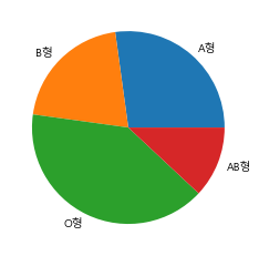
# 파이차트
b_type = [25, 19, 37, 11]
plt.pie(b_type, labels=["A형", "B형", "O형", "AB형"])
plt.show()
In [93]:
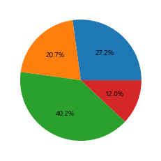
# 파이차트내에 데이터 레이블 추가
plt.pie(b_type,  autopct = "%1.1f%%")
plt.show()
In [82]:
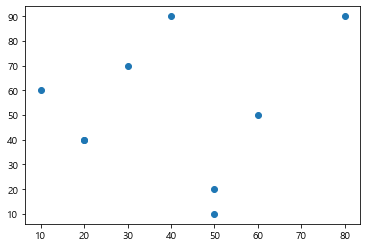
# 산점도 그리기
kor =[80,20,50,20,10,50,60,30,40]
eng =[90,40,10,40,60,20,50,70,90]
plt.scatter(kor, eng)
plt.show()
In [88]:
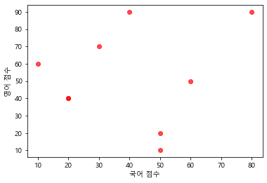
# 산점도 색깔변경
kor =[80,20,50,20,10,50,60,30,40]
eng =[90,40,10,40,60,20,50,70,90]

plt.scatter(kor, eng, color='red', alpha=0.7)
plt.xlabel('국어 점수')
plt.ylabel('영어 점수')
plt.show()
In [95]:
# 산점도의 다양한 색깔 입히기
height =[]
weight =[]
for i in range(100):
height.append(random.randint(100,200))
weight.append(random.randint(20,100))
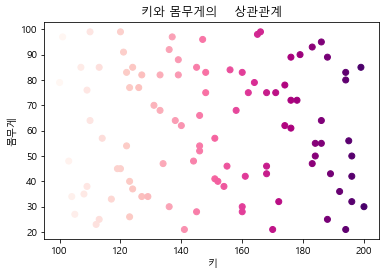
plt.title('키와 몸무게의 상관관계')
plt.scatter(height, weight, c = height, cmap='RdPu')
plt.xlabel('키')
plt.ylabel('몸무게')
plt.show()
In [101]:
In [108]:
In [110]:
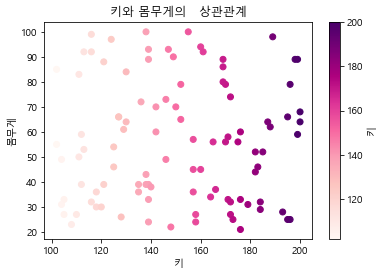
# 컬러바 추가하기
height =[]
weight =[]
for i in range(100 ) :
    height.append(random.randint(100,200))
    weight.append(random.randint(20,100))
plt.title('키와 몸무게의   상관관계')
plt.scatter(height, weight, c = height, cmap='RdPu')
plt.colorbar(label='키')
plt.xlabel('키')
plt.ylabel('몸무게')
plt.show()
In [115]:
# 산점도의 버블차트화 이후 색깔, 투명도 조정
height, weight, score = [], [], []

for i in range(100):
    height.append(random.randint(100, 200))
    weight.append(random.randint(20, 200))
    score.append(random.randint(1, 1000))

plt.title("키와 몸무게의 상관관계")
plt.scatter(height, weight, s= score, c= score, cmap="rainbow", alpha=0.7)
plt.colorbar(label='체육    실기점수')
Out[115]:
<matplotlib.colorbar.Colorbar at 0x15e99002160>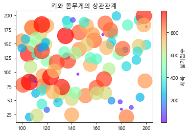
In [122]:
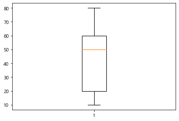
# 박스플롯
kor = [80, 20, 50, 20, 10, 50, 60, 30, 60]
plt.boxplot(kor)
plt.show()
In [121]:
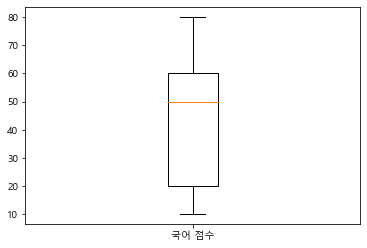
# 레이블 추가
kor = [80, 20, 50, 20, 10, 50, 60, 30, 60]
plt.boxplot(kor, labels=['국어 점수'])
plt.show()
In [118]:
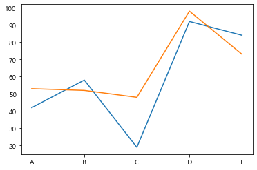
# 이중차트
singer = ['A','B','C','D','E']
week1 = [42,58,19,92,84]
week2 = [53,52,48,98,73]

plt.plot(singer, week1)
plt.plot(singer, week2)
plt.show()
In [ ]:
In [126]:
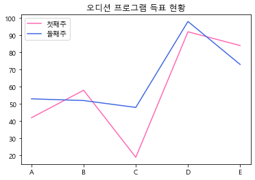
# 이중차트의 레이블
plt.title('오디션 프로그램 득표 현황')
plt.plot(singer, week1, label =    '첫째주', color='hotpink')
plt.plot(singer, week2, label = '둘째주', color='royalblue')
plt.legend()
plt.show()
In [139]:
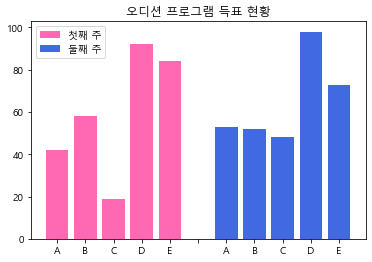
# 이중 막대 가로차트
for i in range(len(week1)):
    week1[i] = -week1[i]


plt.title("오디션 프로그램 득표 현황")
plt.barh(singer, week1, label = "첫째주", color = "hotpink")
plt.barh(singer, week2, label = "둘째쭈", color = "royalblue")
plt.legend()
Out[139]:
<matplotlib.legend.Legend at 0x15e9a103d60>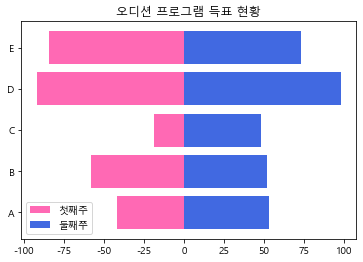
In [152]:
# 이중막대 세로차트 1
singer = ['A','B','C','D','E']
week1 = [42,58,19,92,84]
week2 = [53,52,48,98,73]
plt.title('오디션 프로그램 득표 현황')
plt.bar(range(1, 6), week1, label='첫째 주', color='hotpink')
plt.bar(range(7, 12), week2, label='둘째 주', color='royalblue')
plt.xticks(range(1,12), ['A', 'B', 'C', 'D', 'E', ' ', 'A', 'B', 'C', 'D', 'E'])
plt.legend()
plt.show()
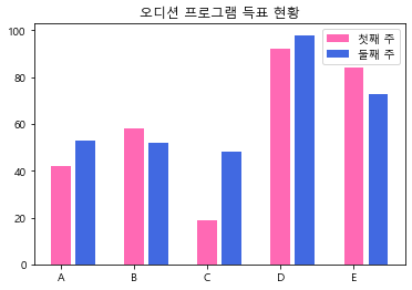
In [154]:
# 이중막대 세로차트 2
singer = ['A','B','C','D','E']
week1 = [42,58,19,92,84]
week2 = [53,52,48,98,73]
plt.title('오디션 프로그램 득표 현황')
plt.bar(range(1, 14,3), week1, label='첫째 주', color='hotpink')
plt.bar(range(2, 15, 3), week2, label='둘째 주', color='royalblue')
plt.xticks(range(1,14,3), singer)
plt.legend()
plt.show()
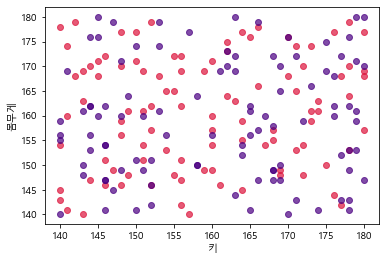
In [158]:
# 이중 산점도1
import random

height1, weight1, height2, weight2 = [],[],[],[]
for i in range(100):
    height1.append(random.randint(140, 180))
    weight1.append(random.randint(140, 180))
    height2.append(random.randint(140, 180))
    weight2.append(random.randint(140, 180))

plt.scatter(height1, weight1, color = 'crimson', alpha = 0.7, label='그룹 1')
plt.scatter(height2, weight2, color = 'indigo', alpha = 0.7, label='그룹 2')
plt.xlabel('키')
plt.ylabel('몸무게')
plt.show()
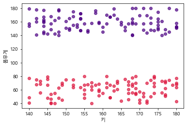
In [159]:
# 이중 산점도2
height1, weight1, score1, height2, weight2, score2 =    [], [], [], [], [], []

for i in range(100):
    height1.append(random.randint(140, 180))
    weight1.append(random.randint(40, 80))
    score1.append(random.randint(0, 200))
    height2.append(random.randint(140, 180))
    weight2.append(random.randint(140, 180))
    score2.append(random.randint(140, 180))

plt.scatter(height1, weight1, color = 'crimson', alpha = 0.7, label='그룹 1')
plt.scatter(height2, weight2, color = 'indigo', alpha = 0.7, label='그룹 2')
plt.xlabel('키')
plt.ylabel('몸무게')
plt.show()
In [160]:
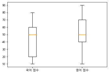
# 이중 박스플롯
kor = [80, 20, 50, 20, 10, 50, 60, 30, 60]
eng = [90, 40, 60, 40, 10, 30, 50, 70, 90]
plt.boxplot([kor, eng], labels=['국어 점수', '영어 점수'])
plt.show()
'경기도 인공지능 개발 과정 > Python' 카테고리의 다른 글
| [파이썬 머신러닝] 회귀, 능형회귀, 로지스틱회귀 (0) | 2022.07.08 |
|---|---|
| [Python 데이터분석] 데이터 분석 기초 1 (0) | 2022.06.30 |
| [django] TODOLIST 앱 등록해보기 (0) | 2022.06.10 |
| [Django] 장고 구조 및 템플릿 사용해보기 (0) | 2022.06.10 |
| [Django] 장고 가상환경 만들기 (0) | 2022.06.09 |